Every page opens on a place, then gets out of the way. Scenery sets the mood; it never sits behind text you need to read.


My WoW Forever · the design system
WaypointWorld of Warcraft: Forever's light, made to be used.
One system for every page of the site: colours from Forever's own art, one signature gesture, a route drawn from what you want to where it is, and components that tell you where their facts come from.
- themes from one set of roles
- 2
- sections, every part live
- 20
- hours of light for scenery
- 4
- images stored in the repo
- 0
Part I · 7 sections
Foundations
The light, the marks and the materials everything else is made of.
Principles#
Five rules every page is held to. When two good ideas conflict, the earlier rule wins.
Relationships are routes: item to boss to dungeon, drawn like ink on a map. Nothing else draws itself.
Every fact says where it came from and which build. Samples are labelled as samples; nothing is made up.
Nothing moves until you do. Hover, focus and choice bring the light; reduced motion keeps every state.
Loading, empty, partial, failed and done are all designed. Undo beats a warning; a reason beats a greyed-out button.
Brand#
The My WoW Forever mark has four bronze bearings around a teal destination gem. Six interlocking circles suggest a returning route; the compact drawing serves navigation, while wings and orbit lines make the ceremonial version fit for larger moments.
Use
On its own where the site is already named: the favicon, the loader, the footer's way home.
Avoid
Recolouring the gem, or setting the mark on busy art without a glass plate behind it.
My WoW ForeverFan-made companionMy WoW Forever
16px24px32px48px
Use
The footer and identity surfaces: mark, name, and what the site is. On the homepage the name accompanies the large interactive emblem beside the arrival headline.
Avoid
Setting the name in anything but Cinzel, or dropping the tagline where there is room for it.
- Clear space on every side is the width of the gem.
- Points are always bronze, the gem always teal; both follow the theme.
- At 40px and under, fine circles and small strokes drop away; the favicon uses its own thicker drawing.
- Never Blizzard’s own logo, emblem, W or wordmark. This is a fan site.
Colour#
Dawn by default, Twilight on request. Each colour is a role declared once for both themes; the values here are read back live from the tokens, with their contrast against the page. Click a swatch to copy its token.
Dawn
Parchment, ink, teal and bronzeTwilight
Indigo, ivory, glowing teal and goldRamps
The primitives the roles are chosen from. Components never use them directly.
Parchment
fffaf1f6eee0eee2cbe2cfaecbb1898f8067685a474d4232
Indigo
efeaf5d4cde6b9b1cf8a86a83d3a632a2744191e450b0d26
Teal
d6eef37fe0ee45c9df3fc5dd1b9cbb0e75930a5f7a063f52
Bronze
fbeccbf0c979d9aa5cb8802fa7733486571d6f45184d2f0f
Dusk
fde6dcf6b8a3f0957ce98b6fd0654aa8462c7d2f1c4f1d12
Lilac
efeafdc9bff5a898e68f7fd07563c95a4aa33f347829224f
Game colours
The game’s own meanings, stepped for each theme so they stay readable on parchment and on indigo.
PoorCommonUncommonRareEpicLegendaryArtifact


WarriorPaladinHunterRoguePriestShamanMageWarlockDruid
Use
Class names in their colour, always beside the class emblem.
52trivial54easy56medium58hard60impossible
PhysicalHolyFireNatureFrostShadowArcane
AllianceHorde
Use
Quest levels against yours; recipe skill-ups; spell schools on abilities.
Provenance
Where a fact comes from is part of the fact. Every record, number and claim carries one of these.
Forever clientClassic 1.12Seen in ForeverCommunity, in reviewCalculated hereUnverifiedBuild1.60.1.70245
Use
Beside the number or record it describes, or once in a record's header when it covers the whole page.
Avoid
Hiding the source behind an icon alone: the word is always there.
Charts
Eight hues from the brand, in a fixed order that keeps neighbours apart for colour-blind readers. Checked, not eyeballed: adjacent pairs clear ΔE 8 in both themes. For maps and scatter plots, where any two marks can meet, use three: gold, rose and sky.
Dawn
Twilight
Stamina by slot
The sample paladin's set
Use
One hue, no legend: the title names it. Values at the bar ends, and a table view one click away.
What the chest slot would change
Gear only, from the client’s numbers.
Thick Obsidian BreastplateAvenger's Breastplate
Use
Always a legend; direct labels on the ends; the text stays in ink, the colour stays in the marks.
Type#
Three faces. Cinzel inscribes names and numerals, as WoW Forever's Trajan capitals do. Fraunces speaks: headlines with soft, rounded serifs. Source Sans 3 does the work: reading, data and interface.
FOREVERCinzelWordmark, eyebrows, numerals. Capitals only, tracked wide.
Chart onFrauncesHeadlines and titles, SOFT 100, optical size by use.
Aa 60 +28Source Sans 3Everything you read or tap. Tabular numerals in columns.
Front title
--wp-title-frontDungeons & raids
Page title
--wp-title-pageTalent calculator
Display
--wp-text-4xlChart your journey through Forever
Heading 1
--wp-text-3xlBlackrock Spire
Heading 2
--wp-text-2xlWhat the chest slot would change
Heading 3
--wp-text-xlChoose one of these rewards
Eyebrow
--wp-text-xs · CinzelUpper Blackrock Spire · 10 players
Lead
--wp-text-lgGuides, gear, talents and dungeons, gathered around the character you are playing next.
Body
--wp-text-mdLionheart Helm adds 18 Strength, 20 hit rating and 28 critical strike rating; at level 60, that is 2.00% hit and 2.00% critical strike.
Small
--wp-text-smGear only: base stats, talents and buffs are left to the simulator.
Caption
--wp-text-xsItem ID 12640 · build 1.60.1.70245
Game text
Text from the game keeps the game’s own voice, set so it reads beside ours.
Lionheart Helm · Freewind Gloves
“Crafted in the forge of a master, for a champion yet to come.” Sample flavour text
The Spire is not taken by the reckless.Unit frame voice line · sample
+18 Strength+120 Stamina+9 Spirit
2,277 armor, proportional
I · II · III · IV Cinzel numerals for sections and ranks
Use
Tabular figures where numbers line up in columns; proportional where they stand alone.
Space, shape and depth#
A four-pixel scale, corners that say what a thing is, and warm shadows at dawn that deepen at twilight.
--wp-space-14px--wp-space-28px--wp-space-312px--wp-space-416px--wp-space-520px--wp-space-624px--wp-space-832px--wp-space-1040px--wp-space-1248px--wp-space-1664px--wp-space-2080px--wp-space-2496pxxs
6pxsm
10pxmd
14pxlg
20pxxl
28pxpill
999pxnotch
corner-shapeUse
Pills for things you press, soft corners for things that hold, notches for game objects (where the browser can cut them).
1
--wp-shadow-12
--wp-shadow-23
--wp-shadow-34
--wp-shadow-4Use
1 for cards, 2 on hover, 3 for popovers and menus, 4 for dialogs. One inner highlight, one warm cast.
Phone< 720pxOne column, sheets from the bottom, tools as icons
Tablet720–1279pxTwo columns; the places move into a menu sheet
Laptop1280–1599pxEvery place in the header; search and the character tighten
Desktop≥ 1600pxEverything spelled out
Use
Content to 1280px with a fluid gutter (16 to 32px); reading columns to 68 characters; components answer to their container, not the window.
Materials and scenery#
Paper, night glass, bronze and light, and three kinds of world: the painted valley for the one hero on a page, vistas anywhere else, and the game's own art for real places.
ParchmentThe page: warm, with a faint grain.
Night glassGame objects: tooltips, talent frames.
GlassControls over scenery; text on solid.
BronzeHairlines and frames, never fills.
The gemWhere you are, and where you go.
Vistas
Layered SVG landscapes at four hours, cheap enough for any banner. They follow the theme, and drift apart as they scroll by where the browser can tie motion to scroll.
Rhumb lines, icons and portraits
Use
Behind covers, openers and empty states: thirty-two bearings from each rose, as on a portolan chart.
Use
Beside words, rarely instead of them. An icon alone always has a label.
Use
Icons by FileDataID, framed in their quality; characters in a bronze medallion lit by their class colour.
Motion#
Calm by default, alive on intent. Motion shows where something came from and where it went; everything can be interrupted; reduced motion keeps every state and drops the travel.
Signature moves
One gesture of our own (the route), and a handful of supporting ones. Try them.
Use
Relationships only: item to boss, boss to dungeon, step to step. It draws once, when the relationship appears.
Avoid
Decoration. If nothing is being connected, nothing draws.
Lightforge Breastplate
Item Level 63
ChestPlate
Requires Level 58
Classic Era drop (unconfirmed in Forever): General Drakkisath, Blackrock Spire
Use
Items you might pick up: a little tilt toward the pointer and a sheen where the light falls. Off under reduced motion and on touch.
| Movement | Tool | Rule | Reduced motion |
|---|---|---|---|
| Scene changes: stage, route, traveller | GSAP (Flip, DrawSVG, MotionPath) | Once per change; interruptible | Arrives in place, route drawn |
| Hover, press, indicators | CSS transitions, linear() springs | 90–450ms; transforms and opacity | Instant |
| Overlays: tooltips, menus, dialogs | CSS @starting-style, allow-discrete | Fade and a short rise | Fade only |
| Theme | View Transitions API | Twilight sweeps in from the switch | Swaps at once |
| Painted world | Image layers, CSS animation | Transforms and opacity; paused off-screen | Still |
| 3D mark | Three.js, loaded once the page is idle | Draws only while it moves | The vector mark |
| Vistas, parallax | CSS scroll-driven animation | Where supported only | Still |
| Across pages: icons, portraits | React ViewTransition | Same object, same name, one morph | Cross-fade |
Part II · 7 sections
Components
Every part the site is built from, live, in both themes.
Actions#
Buttons do, links go. One primary action per view; anything that can be undone is undone, not confirmed.
Use
Primary for the one thing the view is for; secondary beside it; ghost for quiet or repeated actions. Save shows its own progress, then a toast.
Avoid
Two primaries side by side, or a button that only navigates (that is a link).
Loot is AtlasLootClassic’s record until Forever records its own.
Open the dungeon journal Source build on Wago Tools Why this mattersUse
Inline links underline; standalone links carry an arrow; links that leave the site say so.
Share this planCopy the link
Use
Icon-only buttons always carry a label, shown as a tooltip on hover and focus.
Use
Anything people paste elsewhere (links, imports, IDs) copies in one click and confirms in place.
- Lionheart Helm
- Lightforge Breastplate
- Magister's Crown
Use
Removing a thing from a plan: do it, and offer Undo. Destroying something that cannot come back: ask, in a dialog that names what goes.
Avoid
“Are you sure?” for anything reversible.
Inputs and selection#
Labels above, help below, errors in words next to the field that caused them. Every control works from the keyboard and says what it is.
Use
One column, labels on top, the hint where the eye goes next. Validate when someone leaves a field, not while they type.
Avoid
Placeholder text as the only label; red borders without words.
Required level 55–60
Blacksmithing skill 290
Use
Segmented for two to four views of the same thing; chips for filters you can stack; sliders for ranges; a switch for a setting that applies at once.
/
or press ⌘K, Ctrl+K or / anywhere
Use
One search for the whole site, reachable from anywhere with ⌘K, Ctrl+K or /. Escape clears; Enter goes.
Navigation#
You always know where you are: the teal gem marks the current place in every list of places, from the header to the guide’s own route.
Scroll up: the header is the real component. The gem under a link marks the current place; the character chip carries your level and class to every page.
Use
The lockup, seven places, one search, the character you are planning for, and the theme. It is live at the top of this page; on phones the places move into a sheet.
Use
On every record and guide page, above the title. Bronze waypoints between steps.
Use
The database’s own sections, under the header, scrolling sideways on phones.
- Kind
- Dungeon
- Players
- 10
- Bosses
- 14
- Map ID
- 229
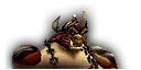
1Highlord Omokk
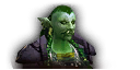
2Shadow Hunter Vosh'gajin
3War Master Voone

4Mother Smolderweb
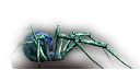
Loot for every boss, from AtlasLootClassic until Forever records its own.
67 quests, from the Classic database.
Use
Views of one record. The ink line draws to the tab you choose; arrow keys move between tabs.
Use
Long result lists. Say how many there are; keep the first and last page in reach.
- Choose a recipeOne you can learn now
- Set the attemptsFive is a good start
- Check your bagsTick what you have
- Gather the restOr trade for it
Use
A process with an order: a guide, an import, the storyboard. Done steps turn bronze; the current one carries the gem.
Feedback and status#
Say what happened, in words, where people are looking. Colour and icons support the words; they never replace them.
Classic data
Boss abilities are Classic 1.12’s until Forever observations replace them.
Try a small batch
Five attempts are enough to see how a recipe’s colour moves.
Two items are not in the simulator yet
Ring of the Martyr and Ring of the Devoured stay empty there.
The import failed
WarcraftDB did not answer. Nothing was changed; try again in a minute.
Saved
Your plan is saved on this device.
Sample character
A Dwarf Paladin in sample gear, labelled as a sample everywhere it appears.
Take heart, champion. The Spire is not taken by the reckless.
Use
Info, tip, caution, danger and done; lore for the game’s own words; sample for anything that is not real data.
Avoid
A notice for something a field error or a toast would say better.
Use
Confirmation of something done, with Undo when it can be undone. A wax seal, one line, gone after five seconds, kept while you hover.
Loading loot tables…
Lionheart HelmHead · plate
Frost Tiger BladeTwo-hand · sword

Arcanite BarTrade good

Crafting attempts done3 / 5
Importing the build
Use
Under a second: nothing. Up to ten: a skeleton in the shape of what is coming. Longer, or steps: progress with a count.
Uncharted
No epic plate matches this sample’s Classic Era loot listings and filters. Loosen a filter, or search everywhere.
Use
Say what is missing and offer the next step. Failures say what still works.
Orange: a skill-up every timeYellow: usuallyGreen: sometimesGrey: never
Use
A scale with meaning in its zones: recipe difficulty, reputation. The marker is you.
Overlays#
Tooltips explain, popovers hold a few controls, menus act, and dialogs ask only when there is no way back. All of them close with Escape and hand focus back where it was.
Copies a link that opens this exact plan.Compare with what you wear
Filter loot
Use
Built on the platform: the popover attribute and <dialog>, placed with CSS anchor positioning. Nothing essential lives only in a tooltip.
Craft Lionheart Helm at 300 Blacksmithing, look up the Classic Era listing for Lightforge Breastplate in Blackrock Spire (unconfirmed in Forever), or start with Frost Tiger Blade.
At level 60 a Retribution Paladin wants hit ratingMakes your attacks and spells less likely to miss. At level 60 in Forever, 10 rating is 1%. first, until attacks stop missing. After that comes critical strike ratingHow often an attack or spell lands a critical hit for extra damage. At level 60 in Forever, 14 rating is 1%., then attack powerAdds to the damage of your weapon attacks..
Conversions from the Forever client’s rating table at level 60: 10 hit rating or 14 critical strike rating is 1%.
Use
Every item name in running text is a link: hover or focus shows the game’s tooltip, and Shift (or a tap) pins it so its terms can be explained. A word a new player may not know gets a dotted underline and plain words, the first time a page uses it.
Avoid
Explaining what the page already says, or hiding a step someone needs inside a tooltip.
Lionheart Helm
Item Level 61
HeadPlate
565 Armor
+18 Strength
Requires Level 56
Equip: Increases your hit rating by 20 (2.00% at level 60).
Equip: Increases your critical strike rating by 28 (2.00% at level 60).
Forever client recipe: Blacksmithing
Shift pins itForever client
Use
The game’s order, the Forever client’s numbers, and a line saying where it all came from. Night glass in both themes, as in game.
Data display#
Numbers line up, every figure says where it came from, and every chart has a table behind it.
| Coverage | |||||
|---|---|---|---|---|---|
| Thick Obsidian Breastplate | Chest | 72 | 814 | +16 | Forever client |
| Beads of Ogre Might | Neck | 63 | Unknown | +7 | Forever client |
| Lionheart Helm | Head | 61 | 565 | +0 | Forever client |
| Runic Plate Shoulders | Shoulder | 60 | 427 | +14 | Forever client |
| Imperial Plate Bracers | Wrist | 54 | 225 | +8 | Forever client |
| Wild Leather Cloak | Back | 50 | 33 | +0 | Forever client |


6 items · client values and labelled Classic fallbacksSample set
Use
Sortable headings, numbers right-aligned in tabular figures, the source in the footer. Compact density is one setting away (see the nav).
- Item ID
- 12640
- Item level
- 61
- Required level
- 56
- Build
- Build1.60.1.70245
- Source
- Forever client
- Verification
- Unverified
Use
The top of every record: what it is, which build, where it came from.
Armor3,690From gear
Strength+120From gear
Agility+39From gear
Stamina+119From gear
Avenger's Breastplate instead of Thick Obsidian Breastplate · build 1.60.1.70245
- Armor
- +171
- Strength
- −15
- Agility
- +12
- Stamina
- +8
- Intellect
- +24
Use
Grouped as the planner groups them; changes as signed deltas with an arrow, never colour alone.
Press ⌘ K to search · Shift pins a tooltip
DungeonNew in ForeverClassic dataIn reviewQuests 67
- Forever client build 1.60.1.70245 released
The current client snapshot for gear and talents; Classic Era fallbacks are labelled.
- 31 dungeons and raids imported
Bosses in the game's own order, loading screens and journal portraits, from the client.
- Game icons indexed
Icons load by FileDataID from WarcraftDB; none are stored here.
- 2 talent records superseded
Duplicate Hunter Lightning Reflexes with malformed X coordinate. Duplicate Priest Holy Specialization with malformed Y coordinate.
Use
What changed and when: builds, imports, corrections. Dated from the data files themselves.
Conviction3 / 55 / 5
Sanctified Judgement0 / 33 / 3
Vengeance0 / 32 / 3
Pursuit of Justice2 / 20 / 2
Use
Only what changed, before and after. Here: a saved Retribution plan and the one being edited (a sample).
Game objects#
The game’s conventions in our materials: quality colours, the tooltip’s order, green for a talent you can take and gold when it is full, orange to grey for skill-ups.
Off handEmptyTwo-hander equipped

Use
Filled, empty (with the client’s own slot art) and wanted. Hover the wanted piece to see what it would change.
DeflectionRank 0 of 5
Increases your Parry chance by 1%.
0 points in Retribution · click to add, right-click to take back
Use
The calculator’s own rules: five points open the next row, parents must be full. A locked talent says why.
Use
The game’s loading screen, tilting a little toward the pointer, with the facts on top.
Use
The journal’s order, the journal’s portraits. The one open is marked.
Maxwell's MissionAllianceClassic 1.12
Travel to Blackrock Spire and destroy War Master Voone, Highlord Omokk, and Overlord Wyrmthalak. Return to Marshal Maxwell when the job is done.
Rewards and details
Choose one of
Also:
- 59Bijou's BelongingsIn Blackrock Spire
- 59Message to MaxwellIn Blackrock Spire
- 60Maxwell's MissionThis quest
Coloured for a level 58 character; at 60 they would all turn yellow.
Use
Level coloured against the character you are planning for; faction in words; the line it belongs to as a route, this quest marked.
Lionheart HelmBlacksmithing · Spell ID 16729
Orange < 320Yellow 320Green ~330Grey 340
- 12 × Arcanite Bar
- 4 × Azerothian Diamond
- 10 × Blue Sapphire
- 80 × Thorium Bar
- 40 × Wicked Claw


Spell, thresholds and reagents: Forever profession database, build 1.60.1.70245. Green is derived from the yellow and grey thresholds.
Use
The skill colours from the client; green is worked out between yellow and grey, and says so.
Attempts
In your bags0 / 5
- Arcanite Bar12 needed
- Azerothian Diamond4 needed
- Blue Sapphire10 needed
- Thorium Bar80 needed
- Wicked Claw40 needed
Use
Totals that follow the number of attempts; tick what is already in your bags.
Burning SteppesRedridgeRiverglades
Use
Layers you can switch, zoom that keeps pins readable, and coordinates wherever you point. The terrain here is drawn for the guide; pins are the atlas’s kinds.
Not built yet, already designed
The site’s scope names these next; the pieces above cover them.
Vendors and trainers
Tables with Coins, the Level badge for requirements, provenance on every row.
Quest chains across zones
QuestChain with steps marked here or elsewhere, the route between them on the atlas.
Build comparisons
Diff for changed points, CompareChart for the stats they move.
Community evidence
Provenance: community, in review; a form built from wp-field; Undo on withdrawal.
Part III · 3 sections
Patterns
How the parts compose into pages, and the habits that make them smart.
Page templates#
How the parts compose into pages. These scaled layout sketches use live components and sourced sample records; follow the linked working pages to try complete flows.

Smart patterns#
Habits that make the site feel like it knows you. All of them small; none of them clever for its own sake.
Choose who you are planning for once. Every page reads it: quests coloured by your level, items compared with your gear, recipes marked if you can learn them.
Planning at level 56
- 59Bijou's Belongings
- 59Message to Maxwell
- 60Maxwell's Mission
One box, everywhere: ⌘K, Ctrl+K or /. It forgives typos, ranks exact names first, groups results by what they are, and jumps within a page as well as between them.
⌘ K then “drakk” → General Drakkisath, Blackrock Spire
The summary first. Sources, formulas and raw values are one click down, never in the way and never missing.
Where this comes from
Armor and stats: the Forever client’s ItemSparse table, build 1.60.1.70245. Rating percentages: the client’s own table at level 60.
Do what was asked and offer the way back. Questions are kept for the few things that cannot come back, and they name what goes.
“Lionheart Helm removed from the plan · Undo”
Filters, builds, tabs and the character live in the URL, so a link shows exactly what you saw, and Back does what you expect.
/dungeons/blackrock-spire/loot?type=plate&type=epicEvery figure carries its build and source. Worked-out values say so; missing ones are shown as missing, never guessed.
Forever clientGreen ~330, worked outUnverified
Theme, density and the character stay with this browser. Nothing needs an account; nothing is shared unless you share it.
Twilight chosen on Tuesday is Twilight on Friday, before the page has even drawn.
When something fails, say what still works and put the retry where the failure is, not in a banner at the top of the page.
58Loot could not load · Try again
Every term a new player meets can be explained where it stands: pin a tooltip and hover the term. Experts never have to read the explanation.
“Increases your critical strike rating by 28” +2% crit
The signature journey#
Follow one of three labelled sample characters from the painted world to a wanted item, its source and a working gear plan. The full-size journey has its own page so each step has room to breathe.
One live scene per page
Follow the route at full size
The four-state journey has its own page, where the painted world, sample character, item, boss and dungeon can be tested with a keyboard or at phone width.
Open the live storyboard Open the real gear workspacePart IV · 3 sections
Reference
The checks every page passes, the voice it speaks in, and where it all comes from.
Accessibility and performance#
The checks every page passes before it ships. None of them are extras.
Contrast
- Text at least 4.5:1 against its surface; the colour section computes it live.
- Marks, borders of controls and focus rings at least 3:1.
- Nothing is told by colour alone: status has a word and an icon, series have a legend.
Keyboard
- Everything you can click, you can reach with Tab and use with Enter or Space.
- A teal focus ring, 2px, following each element’s own corners.
- Arrow keys in tabs, menus, segmented controls and radio groups; Escape closes and hands focus back.
- ⌘K, Ctrl+K or / opens search from anywhere.
Screen readers
- Landmarks and headings in order; one h1 per page.
- Icon-only buttons carry a label; decorative art is hidden.
- Toasts and state changes are announced in a live region.
- Tooltips never hold anything essential.
Touch and phones
- Targets 44px, 36px at the smallest in dense toolbars.
- Sheets rise from the bottom, where the thumb is; nothing depends on hover.
- Every layout is its own composition at 390px, checked down to 320px.
Motion and glass
- Reduced motion keeps every state and drops the travel; loops stop.
- Nothing flashes more than three times a second.
- Reduced transparency swaps glass for solid; text never sits on glass without a plate.
Performance
- The hero is a painting in image layers, one size of each for the screen; what moves in it is CSS, paused off-screen.
- 3D marks load once the page is idle, only on devices with room for them, and draw only while they move.
- Sections off-screen are skipped until near (content-visibility).
- Game art loads lazily by FileDataID; nothing is stored here.
- Fonts self-hosted by next/font, sized to avoid layout shift.
Platform
- Used plainly (Baseline): light-dark(), popover, <dialog>, :has(), container queries, anchor positioning, linear() easing, @starting-style.
- Added where supported, never relied on: corner-shape notches, scroll-driven animation, customizable selects.
Voice and content#
Plain words for a player who is new, exact words for one who is not. Say what happened and what to do next; label every sample; name things as the game names them.
Two items are not in the simulator yet, so those slots stay empty there.
Simulator compatibility warning (2).
Boss abilities are Classic 1.12’s until Forever’s are recorded.
Data may be inaccurate.
Lionheart Helm removed from the plan. Undo
Are you sure you want to remove this item?
No epic plate matches these Classic Era listings and filters.
No results found.
A sample character, in sample gear.
A character, shown as if it were yours.
Save the plan
Submit
House rules
Sentence case for every label and button. Numbers as numerals. Game names spelled as the game spells them. “You” is the reader; “we” is the site, and it says so when it is guessing.
Influences and sources#
Where the ideas came from. WoW Forever’s own art sets the palette; the rest shapes how it behaves.
WoW Forever’s own branding
- Carve a New Path with World of Warcraft: Forever (opens in a new tab)Blizzard News. The compass rose, the teal disc, the parchment.
- What’s Next panel recap and roadmap (opens in a new tab)Blizzard News. Teal banners on sand; dusk-rose skies.
- Collector’s Edition pre-purchase (opens in a new tab)Blizzard News. The parchment map and embossed leather.
- The Forever logo, by Ben Thompson (opens in a new tab)ArtStation. Trajan capitals; bronze around light.
- The Forever beta is live (opens in a new tab)Blizzard News. The build every record here is read from.
Influences
- Portolan charts and the rhumb-line network (opens in a new tab)Wikipedia · Library of Congress. Thirty-two bearings from each compass rose, principal winds in black, the rest in colour: our rhumb lines and the route.
- Material 3 Expressive: motion physics and shape (opens in a new tab)Google. Springs instead of curves, an expressive and a standard scheme: our snappy, bouncy and gentle springs.
- Meet Liquid Glass (opens in a new tab)Apple, WWDC25. Glass for controls over content, text on solid layers, and a solid fallback when transparency is reduced.
- Nested tooltips in Baldur’s Gate 3 (opens in a new tab)Larian · design discussion. Lock a tooltip to explore the terms inside it: our Shift-to-pin item tooltips.
- Messenger, Awwwards Site of the Year 2025 (opens in a new tab)Abeto. A small living world where the journey is the content.
- World of Warcraft: Forever beta interface (opens in a new tab)Blizzard forums. A classic layout with modern comforts, and a radial menu for controllers.
Techniques
- CSS anchor positioning (opens in a new tab)MDN · Baseline, January 2026. Tooltips, menus and popovers placed and flipped by CSS.
- light-dark() (opens in a new tab)MDN. Every role declared once for both themes; any subtree can switch scheme.
- corner-shape (opens in a new tab)MDN · Chromium 139+. Notched corners on game objects, round everywhere else.
- Scroll-driven animations (opens in a new tab)MDN. Vista layers drift apart as they pass; added only where supported.
- View transitions in Next.js (opens in a new tab)Next.js. The theme reveal now; icons and portraits morphing across pages next.
- Relighting images with depth maps (opens in a new tab)Codrops, August 2026. Light that follows the pointer across painted depth.
- GSAP 3.15: Flip, DrawSVG, MotionPath (opens in a new tab)GSAP. The route and the storyboard. All plugins are free.
- How we redesigned the Linear UI (opens in a new tab)Linear. Density and hierarchy for the everyday workspace.
A fan-made design system for a fan-made site. Not affiliated with or endorsed by Blizzard Entertainment. Game art is loaded by FileDataID from WarcraftDB and never stored here; the painted scenes, vistas and the Waypoint mark are drawn in code. The previous guide is kept at /style-guide/forged.